LTSM | Brand Identity
SUPPORT A SPORTS ASSOCIATION IN REDESIGNING ITS VISUAL IDENTITY.
_
EN
EN
LTSM, which stands for Lawn Tennis de Saint-Mandé, is a tennis club in the Paris region. The club has been offering its members clay-court tennis lessons for over 100 years. Founded in 1907, the club launched its website in 1999. The site had not evolved since then.
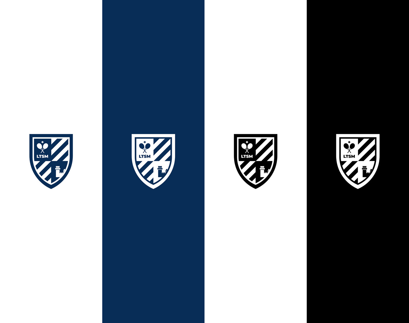
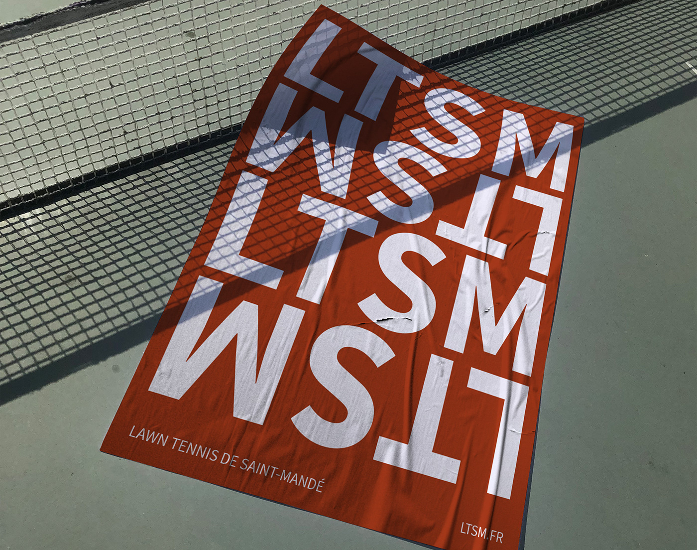
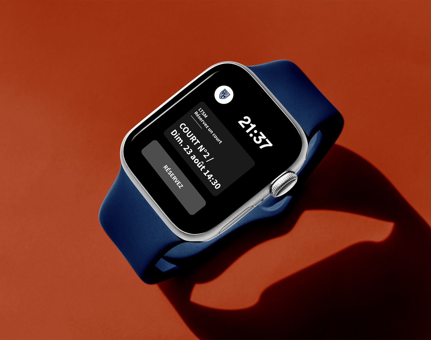
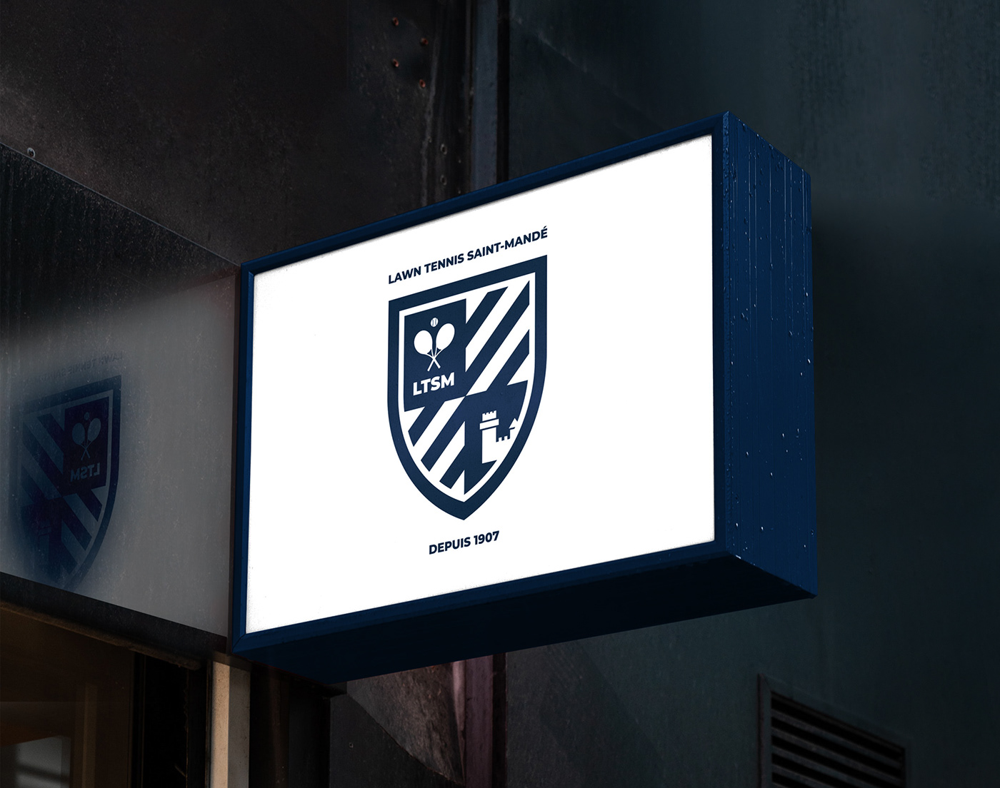
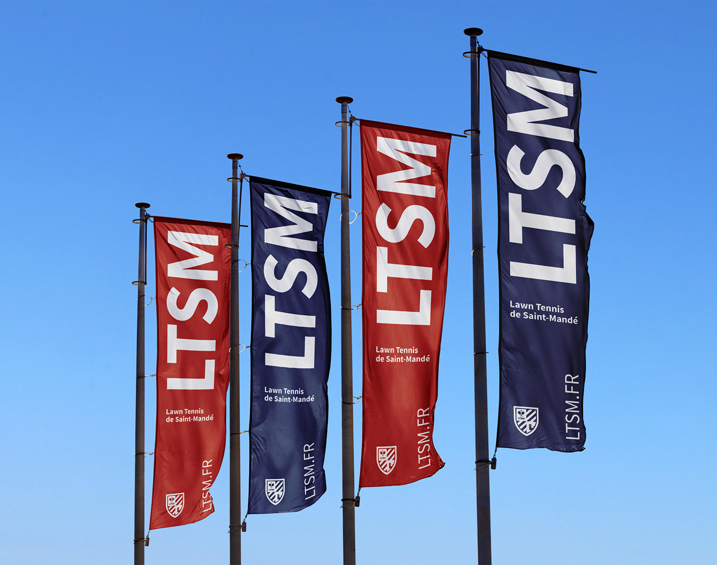
Palantis was approached as part of a total visual overhaul of LTSM, and a modernization of its digital tools. While retaining its historic emblems, the club's logo was designed on the basis of a coat of arms evoking the values it stands for. The main blue color, associated with the club's history, has been retained. An ochre color, reminiscent of clay, was introduced to create contrast with the various elements making up the brand platform.
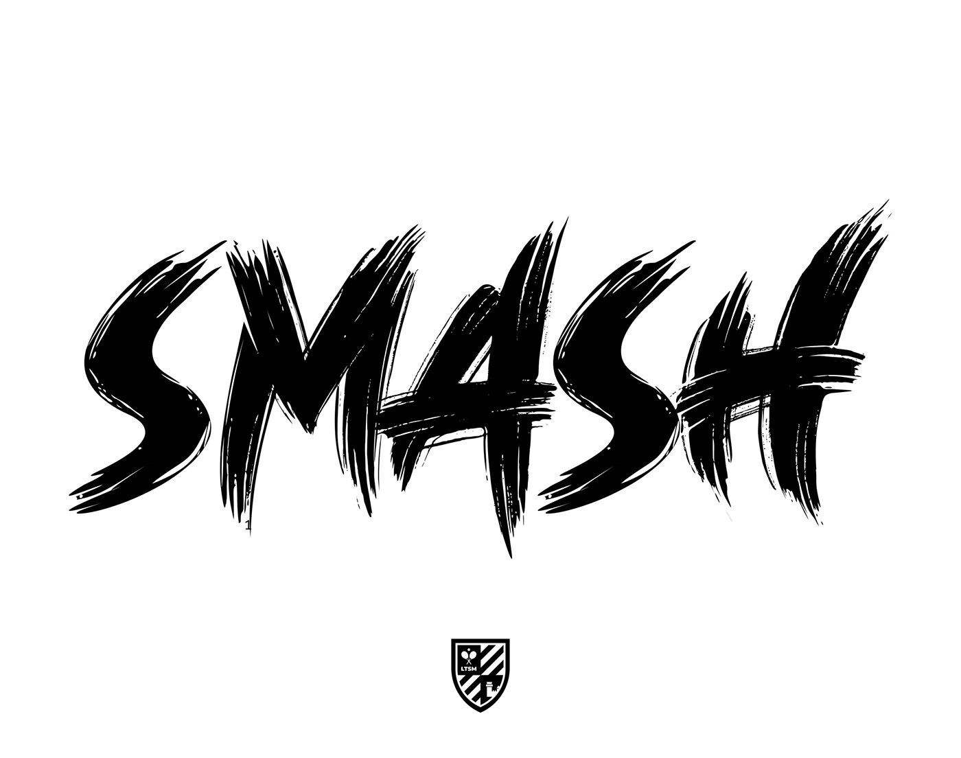
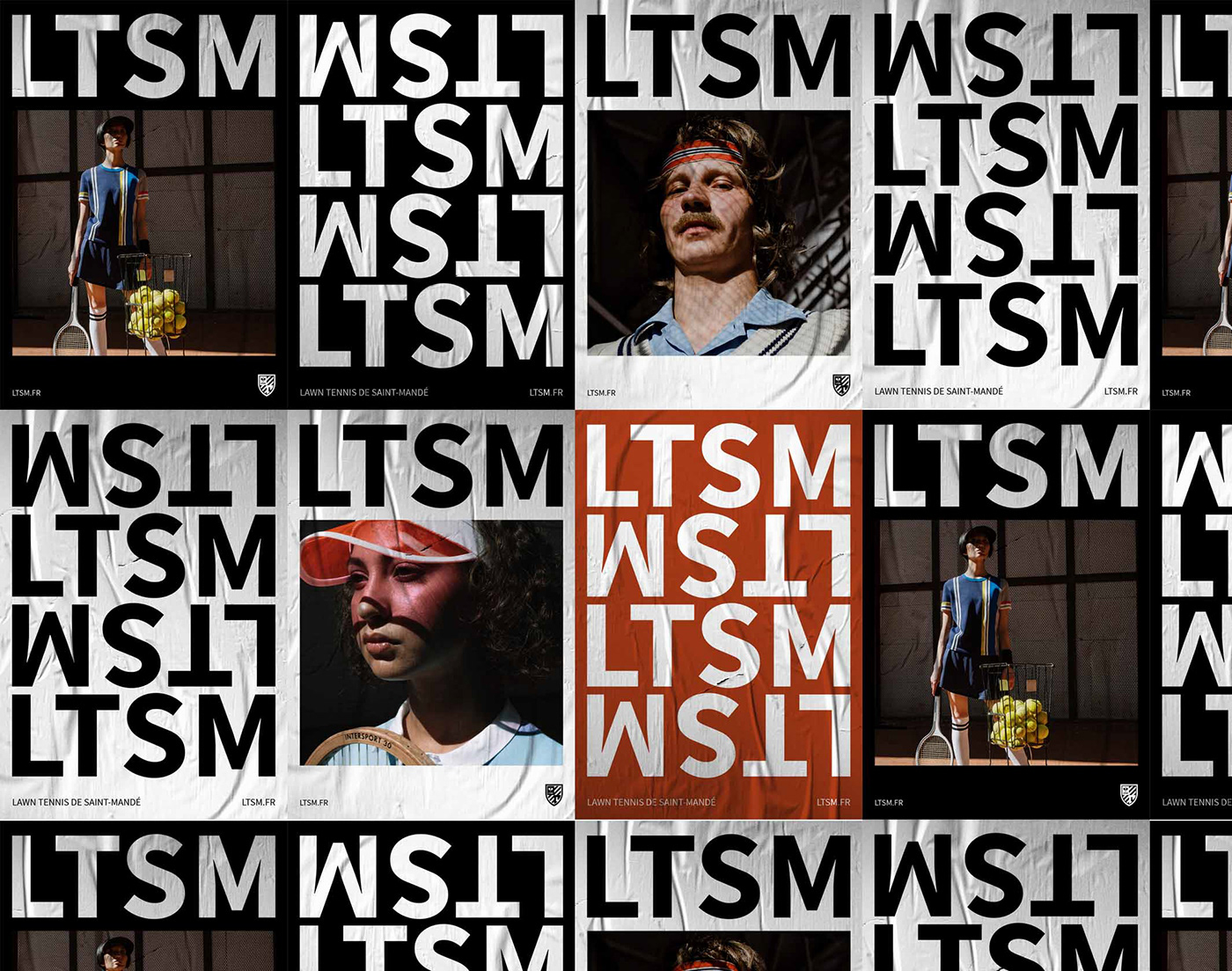
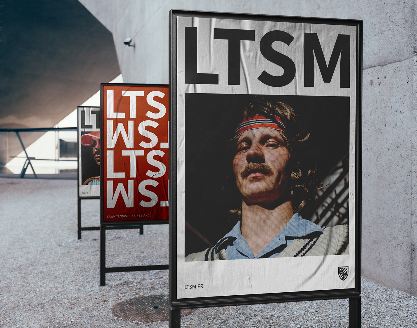
The visual system is organized around two graphic pillars. Geometric, vertical lettering is used for the acronym LTSM, allowing for simple yet visually powerful constructions. Then, a brush-like font style was selected to create tennis-related messages, introducing a playful, impactful aspect and a certain dynamism to the various visual constructions.

LTSM | Brand Identity
ACCOMPAGNER UNE ASSOCIATION SPORTIVE DANS LA REFONTE DE SON IDENTITÉ VISUELLE.
_
FR
FR
LTSM, acronyme de Lawn Tennis de Saint-Mandé, est un club de tennis situé en région parisienne. Le club offre à ses adhérents depuis plus de 100 ans des cours de tennis sur terre battue. Association sportive créée en 1907, c’est en 1999 que le club ouvre son site Internet. Ce dernier n’avait pas évolué depuis.
Palantis a été approchée dans le cadre d’une refonte visuelle totale du LTSM, et d’une modernisation de ses outils digitaux. En conservant ses emblèmes historiques, le logo du club a été conçu sur la base d’un blason évoquant les valeurs défendues. La couleur bleue principale, associée à l’histoire du club a été conservée. Une couleur ocre, rappelant la terre battue a été introduite afin de créer un contraste sur les différents éléments composants la plateforme de marque.
Le système visuel, quant à lui, s’organise autour de deux piliers graphiques. Un lettrage géométrique et vertical est utilisé pour l’acronyme LTSM, permettant des constructions simples, mais visuellement fortes. Puis, un style de police d’écriture façon pinceau a été sélectionné, afin de créer des messages relatifs au tennis, introduisant un aspect ludique, impactant et un certain dynamisme dans les différentes constructions visuelles.